这里是Observed species 稀释曲线的获得方法。它是利用已测得16S rDNA序列中已知的各种OTU的相对比例,来计算抽取n个(n小于测得reads序列总数)reads时出现OTU数量的期望值,然后根据一组n值(一般为一组小于总序列数的等差数列)与其相对应的OTU数量的期望值做出曲线来。
从这个原理看,可以知道的是我们只要定一个随机梯度,对OTU进行随机选取就可以做出这个Observed species的稀释曲线矩阵了。
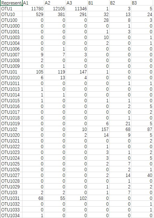
一般的,OTU表格长这样
首先使用python将这个表格处理成用来作图的矩阵
import random
OTU = open("OTU.txt", "r")
ob = open("observed_species.txt", "w")
ob.write("OTU_Num\tOB\tSamples\n")

# 获得样本名
for line in OTU:
	if line.startswith("Representative_Sequence"):
		nameList = line.split("\n")[0].split("\t")
		nameList.pop(0)
OTU.close()

# 再对每个样本进行统计
for i in range(len(nameList)):
	OTU = open("OTU.txt", "r")
	OTU_list = []
	for line in OTU:
		if line.startswith("Representative_Sequence"):
			continue
		else:
			OTU_num = int(line.split("\t")[i+1])
			n = 0
			while n < OTU_num:
				OTU_list.append(line.split("\t")[0])
				n += 1

	selectNum = 0
	while selectNum < len(OTU_list):
		selectList = random.sample(OTU_list, selectNum)
		output = "\t".join([str(selectNum), str(len(set(selectList))), nameList[i]])
		ob.write(output + "\n")
		selectNum += 1000

	OTU.close()
ob.close()
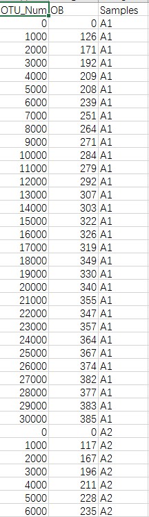
形成下面这样的矩阵
然后就可以在R里用ggplot2画图啦
library(ggplot2)

num <- read.table("observed_species.txt", sep="\t", header=T)
ggplot(num,aes(x=OTU_Num, y=OB, colour=Samples)) + geom_line() +
  labs(x="Number of Sequences",y="Observed Species", fill="") +
  scale_x_continuous(breaks=c(0, 5000, 10000, 15000, 20000, 25000)) +
  scale_y_continuous(breaks=c(0, 200, 400, 600, 800, 1000, 1200, 1400)) +
  theme_set(theme_bw()) +
  theme(panel.grid.major=element_line(colour=NA)) +
  scale_fill_discrete(name="Samples")
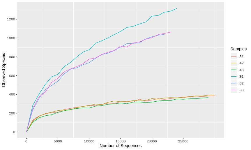
其实还应该把每个样本的对齐,修剪一下的。另外,如果想稀释曲线更加滑溜,可以把梯度调大,或者用ggplot的smooth方法。另外香浓指数稀释等稀释曲线也可以按同样的方式获得矩阵后来画。