画图
主要使用ggplot2进行画图。
library(ggplot2)
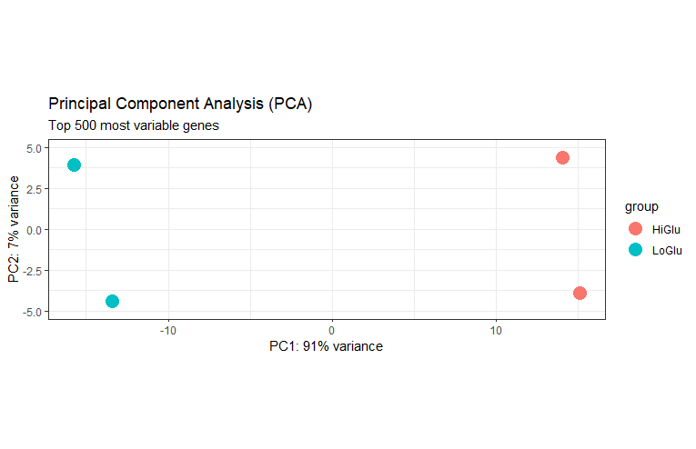
PCA
主成分分析图
dds_rlog <- rlog(dds, blind=FALSE)
plotPCA(dds_rlog, intgroup="Group", ntop=500) +
  theme_bw() + # 修改主体
  geom_point(size=5) + # 增加点大小
  scale_y_continuous(limits=c(-5, 5)) +
  ggtitle(label="Principal Component Analysis (PCA)",
          subtitle="Top 500 most variable genes")
热图
library(pheatmap)
library(RColorBrewer)

# 转换到rlog
dds_rlog <- rlog(dds, blind=FALSE)
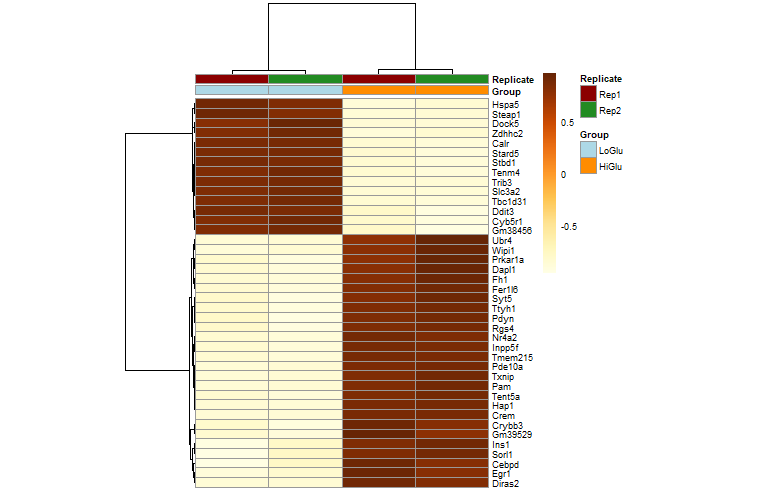
# 获得前40差异基因
mat <- assay(dds_rlog[row.names(diff_gene)])[1:40, ]
# 选择用来作图的列
annotation_col <- data.frame(
  Group=factor(colData(dds_rlog)$Group),
  Replicate=factor(colData(dds_rlog)$Replicate),
  row.names=colData(dds_rlog)$sampleid
)
# 修改颜色
ann_colors <- list(
  Group=c(LoGlu="lightblue", HiGlu="darkorange"),
  Replicate=c(Rep1="darkred", Rep2="forestgreen")
)
# 画图
pheatmap(mat=mat,
         color=colorRampPalette(brewer.pal(9, "YlOrBr"))(255),
         scale="row", # Scale genes to Z-score (how many standard deviations)
         annotation_col=annotation_col, # Add multiple annotations to the samples
         annotation_colors=ann_colors,# Change the default colors of the annotations
         fontsize=6.5, # Make fonts smaller
         cellwidth=55, # Make the cells wider
         show_colnames=F)
火山图
library(dplyr)

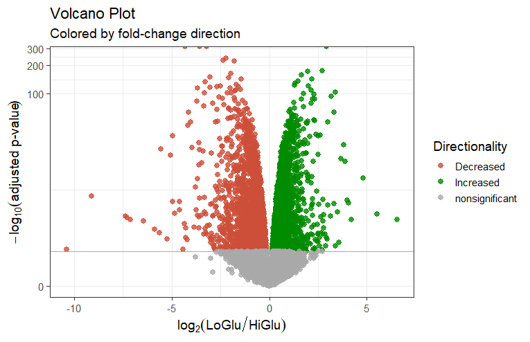
vol_data <- data.frame(gene=row.names(res), pval=-log10(res$padj), lfc=res$log2FoldChange)
# 去除空值
vol_data <- na.omit(vol_data)
# 设定上调与下调颜色
vol_data <- mutate(vol_data, color=case_when(
    vol_data$lfc > 0 & vol_data$pval > 1.3 ~ "Increased",
    vol_data$lfc < 0 & vol_data$pval > 1.3 ~ "Decreased",
    vol_data$pval < 1.3 ~ "nonsignificant"))
vol <- ggplot(vol_data, aes(x=lfc, y=pval, color=color))
# 改图例
vol + ggtitle(label="Volcano Plot", subtitle="Colored by fold-change direction") +
  geom_point(size=2.5, alpha=0.8, na.rm=T) +
  scale_color_manual(name="Directionality",
                     values=c(Increased="#008B00", Decreased="#CD4F39",
                              nonsignificant="darkgray")) +
theme_bw(base_size=14) +
theme(legend.position="right") +
xlab(expression(log[2]("LoGlu" / "HiGlu"))) +
ylab(expression(-log[10]("adjusted p-value"))) +
geom_hline(yintercept=1.3, colour="darkgrey") +
scale_y_continuous(trans="log1p")
MA
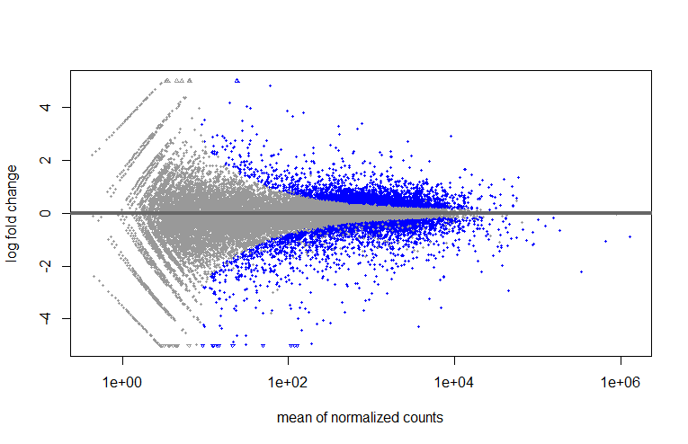
plotMA(res, ylim=c(-5, 5))
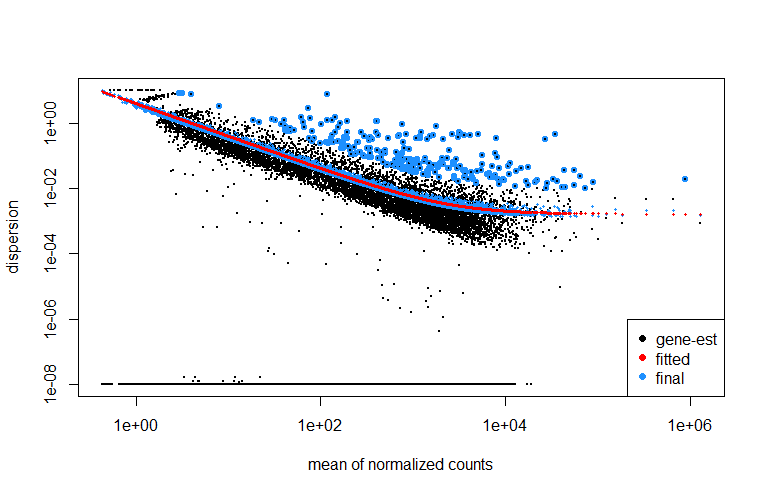
Dispersions
plotDispEsts(dds)
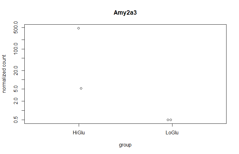
最差异基因作图
# 获得top gene
top_gene <- rownames(res)[which.min(res$log2FoldChange)]

# 画图
plotCounts(dds=dds,
           gene=top_gene,
           intgroup="Group",
           normalized=TRUE,
           transform=TRUE)
做出来的结果与教程不太一样,以后有时间再调整吧。